
Throughout the past few years, data has become increasingly important. While a few decades ago, most traders relied on their own discretion and manual analysis, today, the majority of the volume traded in public equities is being traded by algorithms. These algorithms heavily rely on data. It is very likely that data will become even more important in the future.
With that being said, how can retail traders incorporate some elements of data science into their trading? In this article, you will learn about a variety of different stock market statistics. Hopefully, these statistics will be insightful. But besides presenting these facts, the main goal of this post is to give you an idea about how data can and should impact your trading.
The stock market stats presented in this article are very general stats that are relevant for all traders.
#1 Liquidity Distribution
The first aspect that I analyzed is the liquidity distribution of different equities. The following image is a heatmap of SPY’s volume distribution throughout each weekday in 15-minute increments from the market open until the close. I used data from a 10-year interval: 2009/06/01 – 2019/06/01. The brighter, the higher the volume.
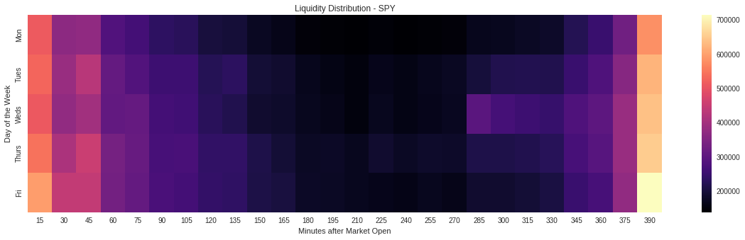
As you can see, the vast majority of the volume is traded within the first and last 15 minutes of the trading day. During the middle of the day, the volume is lowest by far, no matter at which day you look. Unsurprisingly, Friday’s open and close seem to be the most heavily traded times.
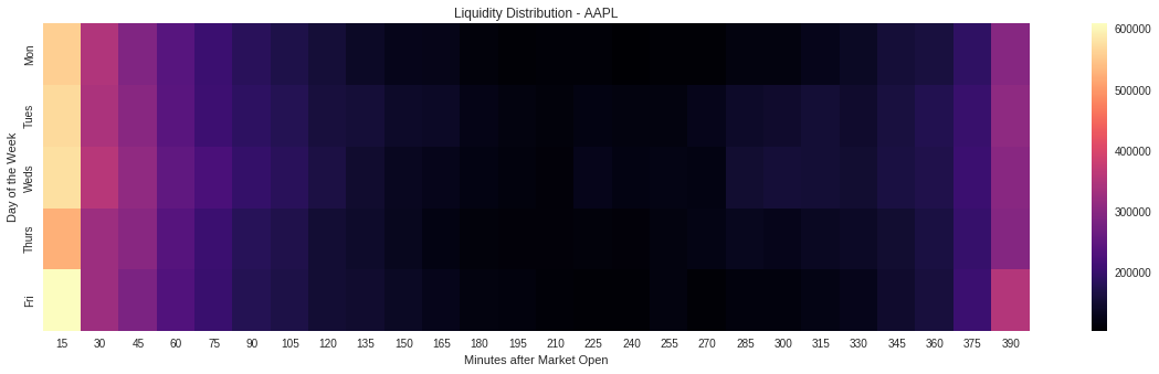
This pattern seems to hold true across most stocks and even other markets. Here is the same chart for AAPL:
So what can you learn from this…?
Being aware of how liquidity varies throughout the day and the week can have some important implications for your trading. For instance, if you are having a hard time getting filled at a good price during the middle of the day, you might just want to wait a little longer instead of adjusting the entry price. Often, your position might still get filled later in the day when volume starts picking up again.
Generally, it can be a good idea to plan to make your trades near the open or close so that you can take advantage of the increased volume levels.
The bigger you are trading, the more important this liquidity distribution becomes.
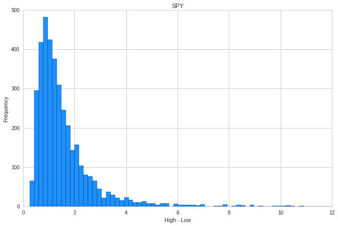
#2 SPY Daily Price Change
Now let’s take a look at SPY’s daily price change and daily range. The following histograms were created from SPY’s price data from 2004/06/01 – 2019/06/01. The first histogram shows the frequency of different-sized price moves in SPY over these15 years.
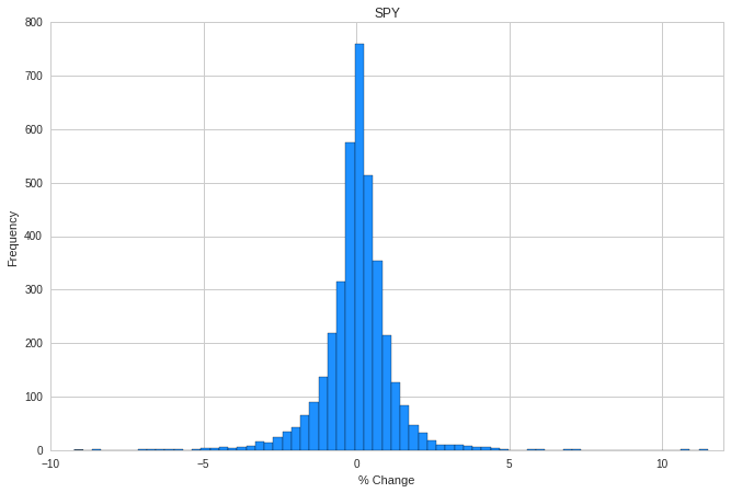
As you can see, the histogram looks similar to a normal distribution diagram. The vast majority of days had a percent change within a few percent up and a few percent down. Only very few days had a percent change of over 5% to the up or downside. Nevertheless, it is important to not neglect the probability of very big moves. Even though they rarely happen, they do happen!
Even though the histogram does resemble the normal distribution, there are other distributions that do a much better job in modeling stock market returns. If you want to learn more about the actual distribution of returns and the risks associated with this, check out my article on the distribution of stock market returns.
Here is a very similar diagram that plots the daily range of SPY:
This diagram tells a very similar story. It, once again, shows that most days have a very similar daily range of under $2. Nevertheless, there are outliers with daily ranges up to over $10.
What are the implications of these histograms?
I’d say that these diagrams are supporting evidence for that high probability options selling works. They show that most of the time SPY’s price changes are within a certain range. Therefore, betting against big price moves can be a very profitable strategy.
On the other hand, these diagrams should be a reminder to always keep your risk in check. Even though big moves in any direction aren’t exactly common, they do occur. So you should always be prepared for them! Never allow such a move to blow you up.
These diagrams look very similar for the vast majority of stocks and other assets.
If you want to learn more about high probability options selling, I recommend checking out my free options trading education.
#3 Volume vs Price Change
Next up, let us take a look at the relationship between volume and the daily price change. For this, I used 15-year’s worth of daily price and volume data (from 2004/06/01 – 2019/06/01). Each dot on the following plot marks the percent change and volume of SPY on a given day.
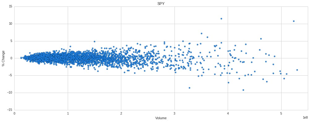
As you can see, there is a pretty visible relationship between the volume on a given day and its percent change. The higher the volume, the bigger the price change seems to be. The correlation between the absolute percent change of SPY and its volume on a day is about 60%. This seems relatively intuitive: the more active the market is, the bigger the price change.
Once again, this pattern seems to repeat among most other equities. Other assets are more or less volatile. However, the general correlation between volume and percent change seems to be quite common.
But if we take a look at the correlation between the daily range and volume on a given day, the picture looks very different:
#4 Volume vs Daily Range
Now we will take a look at the correlation between the volume and price range of SPY. To do this, I used the same dataset as in the previous example.
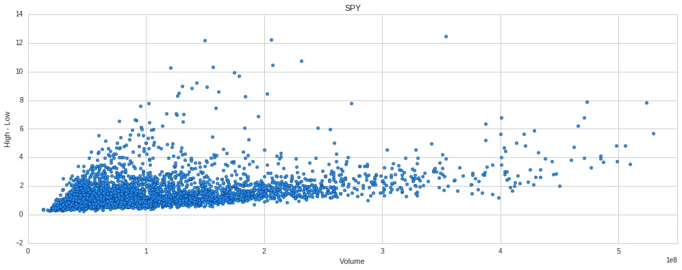
It is clearly visible that the higher the volume, the wider the daily range. However, the opposite statement: the lower the volume, the tighter the daily range is clearly not true. In fact, often the days with the widest daily range only are average volume days. Therefore, the correlation between volume and the daily range for SPY is only about 45%.
If we take a look at AAPL, this slight correlation dissapears almost completely.
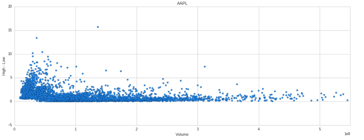
As you can see on this plot, there seems to be practically no correlation between volume and daily range for AAPL. This is the case for many other stocks as well. So even though one might think otherwise, days with higher volume don’t necessarily have wider daily ranges than days with low volume. For stocks like AAPL, days with above-average volume actually have smaller daily ranges than days with normal volume.
#5 Open vs Close
For this stock market statistic, let’s take a look at the open vs the close of SPY. Once again, I used data all the way back from 2004/06/01 until 2019/06/01. The following pie chart has two layers. The outer layer indicates the number of up days (54.9%) vs the number of down days (45.1%). The inner layer tells you how SPY opened on these days. For instance, the inner dark blue piece indicates that on 15% of the days, SPY opened down and closed up, whereas 39.9% of the days, SPY opened up and closed up.
On the other hand, SPY opened down and closed down on 29.7% of the days. Last but not least, SPY opened up and closed down on 15.4% of the days since 2004/06/01.
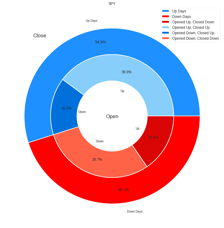
- Opened up and Closed up: 39.9%
- Opened up and Closed down: 15.4%
- Opened down and Closed down: 29.7%
- Opened down and Closed up: 15%
From this diagram, you can see that if SPY opened up, it usually also closed up. Furthermore, SPY tends to close down if it already opens down. A turnaround is much less likely than no turnaround.
This is similar for many other stocks. However, among many stocks, a turnaround from opening up to closing down seems to be more likely than the other way around. An example of this is AAPL and FB:
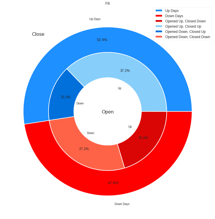
For FB, a turnaround to the upside only happened on 15.3% of the days, whereas a turnaround to the downside happened on 20.4% of the days.
For AAPL the figures are 14.1% and 19.7%, respectively.
#6 SPY vs Other Equities
Now let’s take a look at the correlation between SPY and other stocks. The following histogram plots the difference between SPY’s percent change and QQQ’s percent change on different days.
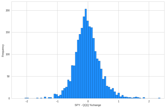
The histogram shows that QQQ and SPY seem to move quite similar. It is very rare that QQQ’s and SPY’s daily percent change differs by more than 1%. In fact, the correlation between QQQ’s and SPY’s daily percent change is about 92%.
It is hardly surprising that two major market ETFs such as SPY and QQQ are strongly correlated. However, it is very common that most stocks have a slight to strong correlation to a major market ETF such as the SPY. For instance, MSFT has a correlation of 67%, AAPL 60%, BABA 51%, DIS 70%, IWM 90%, FXI 71%, IBM 64%, GM 60%, GE 62%, C 70%, GS 71%…
These findings confirm that most stocks follow the overall market. Even a very volatile and seemingly uncorrelated stock such as TSLA has a correlation of about 36%. This means that you should always pay attention to the overall market, even if you are trading in individual stocks. Almost all stocks are affected by the market to some extent.
#7 Yesterday’s vs Today’s Move
For the last stock market stat, let us take a look at the correlation between past moves and current moves. For this, I asked myself the following questions:
- If SPY is up today, how likely is it that it will be up again tomorrow?
- If SPY is up big today, how likely is it that it will be up again tomorrow?
I asked the same questions for the downside.
The result of testing this is that there is no significant correlation between yesterday’s and today’s move. Generally, there is a slightly higher chance that a big up day is followed by another up day. But this really isn’t a predictable pattern. The same goes for the downside.
This seems to be very similar for most stocks. But in my opinion, this isn’t very surprising as I did not really expect such a simple pattern to work.
Conclusion
I really hope these trading statistics were both interesting and insightful. Furthermore, I hope that the presentation of these facts could give you an idea about how incorporating a more data-driven, analytical approach to trading could improve your trading results.
If you enjoyed this article and want to see similar posts in the future or if you have specific aspects that you want me to analyze, make sure to let me know in the comment section below.
I don’t see a trading post with supporting data often. I really like your chart depicting activity at the start and closing bells. This is where the fury all happens and you’ve shown it clearly here. Your dot chart also is really fantastic. These really paint a nice picture. Trading isn’t easy so information such as this becomes really valuable, well done!
Thanks for the comment. I am glad you enjoyed the article.
Thank you Louis. Very nice work. Looking at this was a ‘WOW, nice information’ moment. Real light bulb moment was when I realized that by doing this type of thing I can shave hours of my trading system development time (non options) by calculating parameters I optimize on like this. Not only will the optimization be quicker, it also make the danger of curve-fitting and over-optimization smaller. THANK YOU.
Hi Johan,
Thanks for your comment. It’s awesome to see that you could find some value in this post!
Thank you for this informative article, your trading statistics, illustrations and facts are very educational. I agree with you that incorporating a data and analytic approach to stock trading will result in positive results for both the novice and intermediate trader. Personally I am excited to follow your advice. What are the best sources to acquire trading data and analytic training?
Thanks for your comment. One good source is Quantopian. Another data provider is called Quandl. But note that Quandl can be quite expensive for retail traders.
Hello Louis
Your videos are really very instructive. Also your statistics are useful. I am interested in trading around earnings statements. Can you see if there is a correlation between the movement of share prices in the, say, five days after an earnings statement (not including the day of the earnings statement) and the fifteenth to twentieth day after the earnings statement?
Thank you
Regards
Jeffrey
Hi Jeffrey,
Thank you very much for the positive feedback! I am glad you like my content.
Investigating stock returns around an earnings announcement sounds interesting and I hope I’ll create something around this topic in the future. But I can’t promise anything soon since the list of upcoming content is already quite long. But I added it to my list of future content ideas.
In the meantime, I recommend looking at some research papers that analyze returns around earnings. This should give you a much more detailed breakdown of the topic than I ever could provide.